
Brand
Brand Guidelines
The Kraven logo, its colours and how to use them. If you are writing about Kraven or working with us, take the files from this page rather than copying them from a screenshot.
The logo

Logo
The frame mark with the KRAVEN lettering, in white. The first choice wherever there is room, on dark backgrounds.
Download PNG
Mark, blue
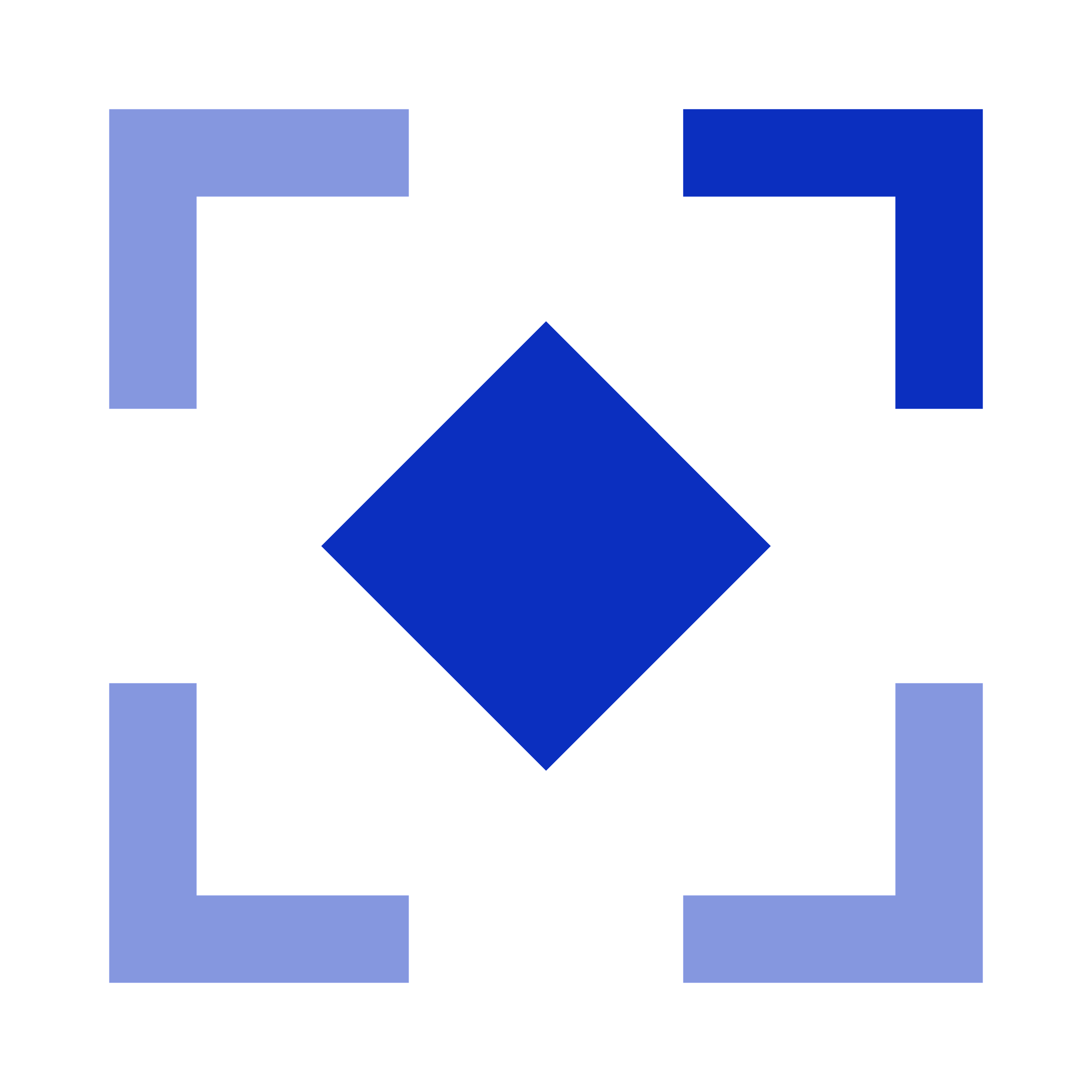
The frame mark on its own, in Kraven Blue. For light backgrounds, and where the name is already written nearby.
Download PNG
Mark, white
The frame mark on its own, in white. For Kraven Blue, Midnight and other dark backgrounds.
Download PNG
App icon
The blue mark on a rounded white tile. For profile pictures, app icons and anywhere a square is needed.
Download PNG


How the logo is built
- Four corners of a square frame, each an L of the same weight, with an open gap in the middle of every side.
- A solid diamond, a square turned on its point, at the exact centre of the frame.
- The top right corner and the diamond are at full strength; the other three corners are tinted lighter, so the eye is led up and to the right.
- The mark is square. In the logo it sits to the left of the KRAVEN lettering, centred on its height.
A square
Everything sits inside one square, on its centre lines.
Four corners
The square opens in the middle of each side, leaving a frame.
The diamond
A square turned on its point is set at the centre.
One bright corner
Three corners step back; the top right stays at full strength.
Colours
- Midnight#050A24Backgrounds.
- Kraven Blue#0B2FBFThe mark, and the brand’s main colour.
- Signal#4A86FFHighlights and accents.
- Ice#EEF3FFLight backgrounds and text on dark.
Using the logo
- Clear space
- Keep an empty margin all round the logo at least as wide as one corner of the frame. Nothing else, no text, edge or picture, comes inside it.
- Smallest size
- On screen, the mark is at least 16 pixels wide and the full logo at least 96. Below that, use the mark alone.
- Background
- White logo on Midnight, Kraven Blue or another dark, calm background; blue mark on Ice or white. Over a photograph, choose a quiet area and keep the contrast strong.
- Writing the name
- In a sentence it is “Kraven”, with a capital K only. All capitals, KRAVEN, is for the logo itself. On X it is @Kraven_Ai.
Please don’t
Stretch, squash, rotate or slant it.
Change its colours, or give all four corners the same strength.
Add shadows, outlines, gradients or effects of your own.
Redraw it, move the lettering or change its typeface.
Crop it, or place it where it is hard to read.
Use it to suggest a partnership with, or endorsement by, Kraven that does not exist.